A Pulse Oximeter Changed How I Code (and What I Think About Healthcare)

I bought a pulse oximeter, one of those little fingertip sensors you see in hospitals, partly out of curiosity, partly out of boredom. The idea was simple: if programming is a marathon of attention, maybe I could see what my body was doing when my brain started to lag.

It turns out, a $20 device can tell you a lot.

After a week of logging readings during coding sessions, a pattern appeared. When I was deep in flow, my oxygen saturation (SpO₂) stayed steady, and my heart rate had a subtle rhythm. It was up slightly when debugging, down when refactoring. But when I slouched, skipped water, or pulled a too-long stretch without standing, my SpO₂ dipped a few points. Nothing dramatic, but enough that I felt the difference: foggy thinking, slower reactions, more tab-switching.

It was oddly validating to see the physiology of burnout in real time.

Then I started noticing something else: interpreting those readings felt like doing data science on myself. One measurement means nothing. But the trend over hours told a story. Which made me think about healthcare more broadly.

I even had a little spike at one point – scary! But I had to take it in context. As they say, think horses, not zebras.

Doctors deal with this same puzzle at scale. A single pulse-ox reading can be misleading; what matters is the pattern and the context. I started appreciating how fragile and dynamic the human baseline really is, and how much judgment goes into deciding what counts as “normal.”

Programming teaches us to respect abstraction and precision. Healthcare, I realized, teaches the opposite: humility in the face of variance. My little experiment bridged the two.

So I’m still using the pulse oximeter. Not to “optimize performance,” exactly, but as a reminder: your brain runs on oxygen. Your best code might start with a deep breath and a good posture check.
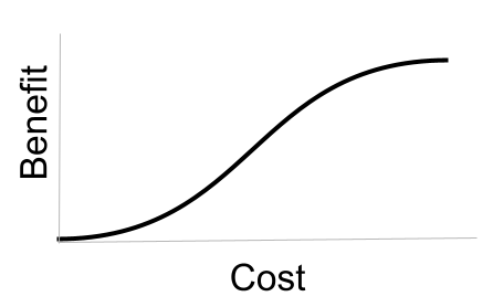
Cost-Benefit Curve

I’ve realized that I often stumble when explaining the concept of “marginal benefit”. I always have the image above in my head, but actually haven’t seen it too often displayed in the world. So I’m taking a moment to put it in the world, along with the implications of the mental model it represents:

  • Start at the lower left. That’s the very moment that you undertake a project. Zero cost (dollars and hours) and zero benefit (the world has not changed one bit).
  • Now imagine spending just the minimal amount, inching to the right along the curve, before walking away. It will have been a low-cost project. But it will still have almost zero benefit. If you’re thinking of starting a lemonade stand, that’s like spending 1 hour and $1 to buy lemons. If you do nothing else, your profit is the same as if you hadn’t started.
  • If you keep moving, you start to see some benefit. Things get really exciting halfway across the curve. You’ve seen some definite benefit, and every bit of additional cost is returning a huge amount of benefit. That’s like spending 10 hours and $10 on actually buying ingredients and setting up your stand for a few days. You’ve got regular customers, and you’re selling as fast as you can make the stuff. Of course you’d spend the 11th hour and 11th dollar to keep going – the benefit is almost guaranteed.
  • But to the far upper right, the potential benefit maxes out. If you’ve sold 7 billion glasses of lemonade, there are no more thirsty people anywhere on earth. Putting in additional time and money will have no impact at all.

Everyone gets this intuitively, but we don’t have good shared vocabulary around it. We definitely don’t have good vocabulary around the different ways that curve could be stretched and squeezed.